
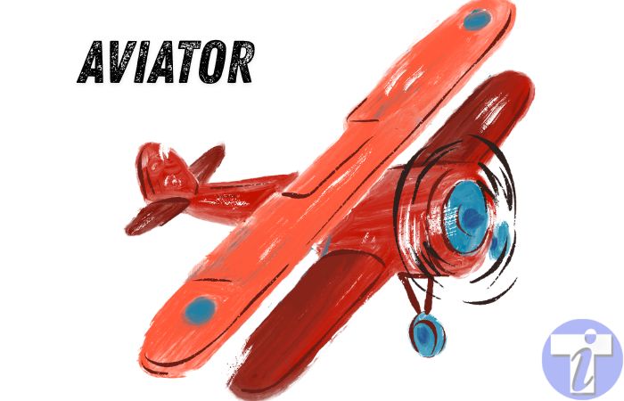
Some casino games are built around layers. More symbols, more buttons, more bonus features, more things happening at once. Aviator goes the other way. It takes one simple idea and puts nearly everything on that single moment: when to cash out.
That is what makes the Aviator game interesting from a tech and design point of view. It does not feel complete because the screen is packed. It feels complete because every part of the game points toward the same decision. A plane takes off, a multiplier rises, and the player watches the round unfold in real time. For anyone looking at the Aviator game on Betway’s platform, the first thing that stands out is how quickly the screen explains itself without needing a heavy introduction.
One Decision Does Most of the Work
Aviator is built around a very clear loop. The round starts, the multiplier climbs, and the player chooses whether to cash out or stay in. That is it on the surface. But that one decision creates the whole feeling of the game.
This is different from many online casino formats. In slots, most of the action comes after the spin. In roulette, the bet is placed before the wheel decides the result, while the Aviator game on Betway puts the key decision inside the moving round itself. The player is watching, waiting, reacting.
That is why the design has to stay focused. If the UI becomes too busy, it pulls attention away from the multiplier. If it is too empty, the game can feel flat. Aviator works because it keeps the important things close: the rising number, the plane, the cash-out button and the round flow.
The Tech Has to Stay in Step
A simple-looking game can still need serious tech behind it. Aviator depends on timing. The multiplier has to move smoothly. The animation has to match the game state. The cash-out button has to respond quickly. The result has to feel connected to what the player saw on screen.
This means the platform has to manage real-time event handling, server communication, animation syncing and fast input response. When a player taps cash out, the action needs to register, reach the server, be confirmed and return clearly to the screen. If that feels delayed, the whole rhythm suffers.
Low latency matters here more than it would in slower casino games. A tiny delay may not matter much in a game where the player simply waits for a result. In Aviator, timing is part of the experience. The tech has to support that feeling from the first second of the round to the last.
Why the UI Feels So Direct
A well thought of UX is often about removing friction. Aviator shows that well. The player does not need to search for the main action. The cash-out button is the centre of the experience, even if it is not always visually loud. It needs to be obvious, easy to tap and clear in its state.
That matters especially on mobile. The UI has to work on small screens, different browsers and different connection speeds. The multiplier must remain readable. The button must sit naturally within reach. The animation should feel smooth without asking too much from the device.
This is where lightweight design helps. Aviator does not need heavy graphics because heavy graphics would not improve the main decision. A cleaner screen can load faster, run more smoothly and keep the player’s attention where it belongs.
A Full Experience Without Extra Noise
Online casino platforms have to think about games like Aviator differently from classic casino games. Its strength is not in having many layers. Its strength is in how tightly the tech, UI and UX design support one simple action.
That is why Aviator feels like a full game experience rather than just a minimal idea. The motion gives it pace. The multiplier gives it tension. The button gives it control. The tech keeps everything moving together.
In a crowded online casino lobby, that kind of clarity can stand out. Aviator proves that a game does not need to be visually heavy to feel engaging. Sometimes one decision, supported by smart design and reliable tech, is enough to carry the whole experience.