
Managing a portfolio of projects without a clear visual overview is like trying to complete a jigsaw puzzle without seeing the picture on the box. You might have all the pieces, but without knowing how they fit together, it’s easy to waste time, duplicate efforts or miss critical connections.
This is where project portfolio management (PPM) tools with strong visualisation features come into their own. Traditional spreadsheets and static reports can only take you so far. They list information, but they don’t help teams see how everything relates. That’s why businesses are increasingly turning to platforms that allow them to visualise data in ways that support better decisions and clearer communication.
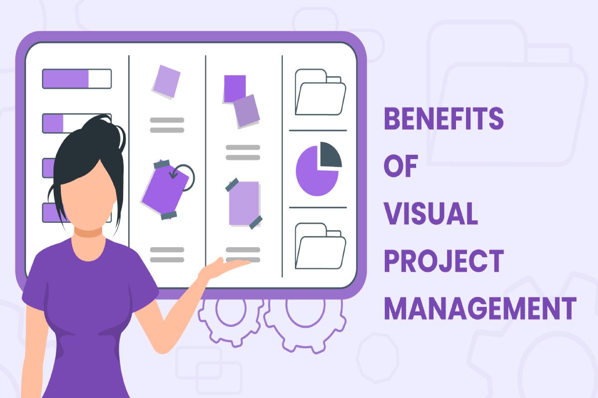
Modern project portfolio management software enables users to build dynamic, interactive views of their entire project landscape. Instead of scrolling through endless rows of data, teams can explore timelines, dependencies, budgets and risks through dashboards, heatmaps and charts. These visuals not only make information easier to understand but also help uncover insights that might be buried in traditional formats.
Seeing data in context allows for better prioritisation. For example, it becomes easier to spot which projects are overlapping, which are lagging behind schedule or which ones are draining more resources than expected. Visual dashboards can also highlight misalignments between projects and strategic goals, helping leaders reallocate effort where it will make the most impact.
Visual tools improve collaboration too. When stakeholders from different departments meet to discuss the project portfolio, they often bring different perspectives and priorities. A shared visual reference helps align those viewpoints. Rather than debating over separate documents or conflicting numbers, teams can explore the same live data in real time. This supports more focused conversations and faster decision-making.
These tools are particularly valuable in cross-functional environments. When marketing, product, finance and operations are all contributing to major initiatives, they need a shared understanding of progress and outcomes. Visual PPM software brings that shared understanding into one accessible space.
Another advantage is stakeholder engagement. Executive leaders, board members and other senior decision-makers don’t always have time to dig into detailed reports. A well-structured visual portfolio lets them grasp the current state of projects quickly and focus on the areas that require attention.
By turning data into insight and insight into action, PPM tools with strong visual capabilities provide a powerful edge. They help teams focus, adapt and align their work with strategic objectives. In a competitive environment, this kind of clarity can make all the difference.